
WordPress web design trends that impact user experience are some of the best sources of inspiration out there. Each of the trends in this roundup does something to make the website work better or be more understandable for users for a stronger overall UX.
Here are five great trends to consider this month:
1. Navigation Buttons
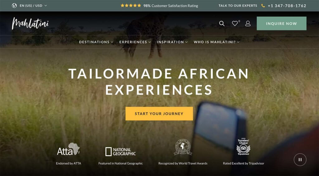
A button in the main navigation of a website highlights a key action or activity. It can be more attention-getting than other navigation elements but still fits in the structure and flow without feeling out of place.
To maximize the impact of a navigation button, pair it with actionable microcopy, such as what’s used in the example from Mahlatini, and use a color that stands out from other nearby elements.
2. Tiny Animations
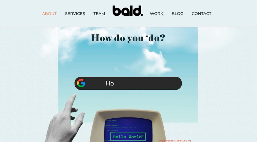
The best animations are tiny. Too much movement in a website design can be distracting and even nauseating. Still, tiny animations can be delightful and help users better understand the content and move through the design. Check out this example from Bald.
In the example above, there are subtle animations throughout the homepage scroll. Each helps direct the eye and provides context for the design. They are also rather delightful for users.
3. Great Calendars

If your website features events of any kind of events, a great calendar is a must-have. With more events happening in person as the pandemic wanes, this is a feature that we are seeing more of all the time. Just check out The Events Calendar for a great example.
Great calendars have a few things in common:
- They are easy to read and understand
- Integrate with sales (if needed to buy tickets for an event)
- Include images and event details
- Let you save events to your own personal calendar
- Look and feel like the rest of the website design for a cohesive presence
4. Unexpected Details
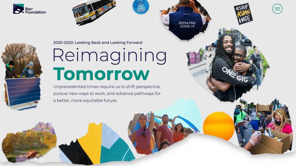
Did you notice the torn edge in the example from the Barr Foundation above? Then look closer, and all the image frames use a similar effect. Scroll and that edge meets another “screen” that closes the shape in the website design.
All these elements come together to create an unexpected series of details that help move users through the design in an interesting way – visually and with scroll motion.
An unexpected detail is anything that’s just a little different and out of the ordinary for a website design. It can be something that fills the screen, such as the example above, or fun phrasing in microcopy to a neat illustration or hover state.
Details are that finishing touch for a design that sets apart average websites from those that wow users.
5. Integrated Navigation
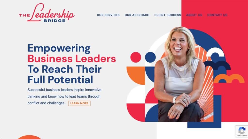
It’s been a bit of an unwritten rule that website navigation is separated from the rest of the website design. But what if it isn’t?
The example above from The Leadership Bridge shows that it can be stunning and still work just as effectively. (You aren’t wondering where the navigation is here.)
This integrated style of navigation helps create a more cohesive canvas area for the homepage. However, you do have to think about configuration a bit for everything below the scroll or forget sticky navigation altogether.
There’s also a nice detail here where the navigation elements cross between the varying color blocks.
Putting it All Together
WordPress web design trends are a fun element but don’t feel like you have to try every new trend that comes along. Pick the ones that are right for your website and brand to keep it feeling fresh and modern.
Carrie Cousins has more than 15 years of experience in media, design, and content marketing. She works in digital marketing and is also a freelance writer and designer, specializing in creating amazing experiences online for small businesses. Her work has been featured in publications such as Design Shack, Webdesigner Depot, The Next Web, and Fast Company. She’s an avid runner, which comes in handy with Australian shepherds at home.