
Almost every website a form of some kind. The following best form examples and tips will help you learn how to create an enticing form and form page that will help generate interactions and conversions.
From how to use form pages to elements of a form that facilitate user flow to form plugins, these examples are sure to help you feel a little more creative as you design form elements for your website projects.
Let’s dive right in!
What Are Website Forms Used For?
First things first, a web or HTML form is any interactive element on a website that allows users to input information that’s then sent to a server or another app for processing.
Forms are a valuable tool for websites because they allow you to collect data and information in a way that’s easy for users. Good forms can even validate certain informational elements to ensure the data you capture is accurate.
- Almost every website has some type of form.
- Signup for emails
- Checkout
- Registration
- Interest
- Login to website/account information
- Contact
- Survey
- Search
- Support/chat
- Another type of lead
You need a form page to ensure that website visitors understand why a form is there and why they should use it. The form page should be designed to optimize interactions and successful completions of the form.
These pages on your website should do a few different things to encourage form completions.
- Use directional cues to guide users to forms on the page. That might include anything from white space to arrows to “movement” in the direction of the form on the page.
- Include content that sells the value of the form and engages with it. What does the user get if they fill out the form? There has to be a benefit to entice completion.
- Design a page that’s visually appealing and looks like it has credible authority. No one wants to provide information in a place that seems sketchy or like the information will be abused. Use color, contrast, typography, and strong writing (including microcopy) to help direct website visitors to the form.
- Everything on a form page should lead the website visitor to the action of completing the form. Try to avoid cluttering form pages with too many other instructions or calls to action. Make it clear what the page is for – to fill out the form.
- Include the form on your form page. There’s no point in creating a form page that explains why someone should fill out a form and then make them click to another place to fill it out. The form page should contain everything the website visitor needs to understand the form and complete the process.

What Is a WordPress Form Plugin?
If you use WordPress, a form plugin can can make creating and managing forms a lot easier. WordPress users are almost all in agreement about one thing when it comes to forms: a WordPress form plugin is the way to go.
A WordPress form plugin is a tool that integrates with your WordPress website and helps you create forms with precoded elements, a database to store results, and automations (such as email sends or payment processing) that connects your forms to actions.
Many form plugins have drag-and-drop builders with various form field defaults to make building quick and easy. For the most part, they are created to work with your website CSS so that forms look like part of the overall website design. The plugin then allows you to customize fields to meet your needs further.
Additionally, form plugins often come with some starter forms to help you think about the logic of putting forms together, the order of fields, and how they should look overall.
If you are in need of a form plugin, consider Kadence Blocks Form Block. Also, check out the best WordPress forms plugins for 2022 for more form plugin options.

How Do You Make an Effective Website Form?
An effective web form has two distinct elements: It’s easy to understand visually and functions as you would expect. Without these elements, most forms will fall flat or sit on a website without being used.
Effective visual elements of a form include:
- Clear purpose and direction for the form with a header, description, and instructions (if necessary)
- Appearance that matches the rest of the website so that the form looks like it is part of the website experience
- Plenty of space to fill out form fields on desktop or mobile devices
- Smart options that help users understand what you need – use buttons and checkboxes where you can rather than short answers; for phone numbers or dates, provide a format
- Easy to see the completion action button to finish form activity
Functional elements of an effective form include:
- Keeping forms as succinct as possible by only asking for necessary information
- Smart defaults, such as location information for ZIP codes
- Error messages that help users if they get something wrong
- Keeping forms to a single page
- Forms must be responsive and fit appropriately to screen or browser size
- Secure data transmission
- Feedback loop to let a user know the form was completed successfully (on-screen message, email, text message, or any combination)
How Do You Make a Website Form Look Professional?
A professional form is clean, easy to understand, and looks like it is part of your website design. It should be easy to read, include clear communication about the purpose of the form, and be free of errors.
While all of this sounds pretty simple, it’s embarrassing how many website forms don’t meet these simple needs.
A website form that has a professional look and feel is trustworthy to users.
How Do I Create a Form Page on My Website?
Creating a form page is pretty easy. It should follow the same design rules, style, and principles as the rest of the website design. The big difference is that the content explains the value of the form, and it is right there on the page.
Most form plugins are designed so that you can create a form and then embed it on pages on the website. That’s precisely how you will create your form page.
When it comes to creating the form page, one of the primary things to keep in mind is the placement of the form itself. Where on the page is it located?
The best practice for form placement on a page is near the top. You want the form to be visible above the scroll so that users immediately know what the page they are on is about (filling out the form). On mobile, the form should also be high on the page, with a small bit of descriptor information above it.
Once you set the design of the form page, you only have to embed your form (if you are using a plugin such as Kadence Blocks) and then make sure it fits into the space nicely.
What Elements Are on a Form Page?
The best form page is simple. The same is true of your form itself. Whether you are helping someone process payment through checkout or sign up for an email list, fewer fields that are easy to fill are ideal.
Use that same philosophy on your form page.
It should include:
- A hero image or header with text that tells you what the page is about
- A description of what the form is for
- The form itself with a completion message
- Secondary information for users that aren’t quite ready to use the form and need more, such as links to other products or an FAQ page
- Static website elements such as a header and footer that are consistent with the rest of the website design
5 Website Form Examples We Love
Form pages don’t have to be boring. They can be wildly creative as long as the function to guide users is there. Here are five website form examples that are both beautiful and functional.
1. OrangeTheory Fitness

Smart form pages make everything easier for users. OrangeTheory Fitness uses location data to help users find the location closest to them so that when the form is filled out to book a class or log in to sign up for a class, the form has already preselected the right location. This saves users from looking through long lists of options and helps prevent user error. Then the form is simple, asking for only the information they need and explaining why the data is important.
2. Nike Member Registration
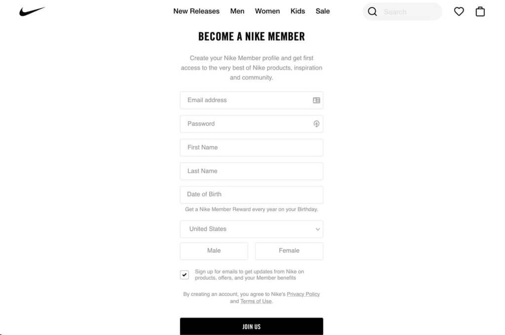
The member registration page from Nike is about as simple as it gets, with a minimal design that features just the header and the form. Note the description that tells users why the information is important and form fields that have plenty of room around them for easy fill ability.
3. Travelocity
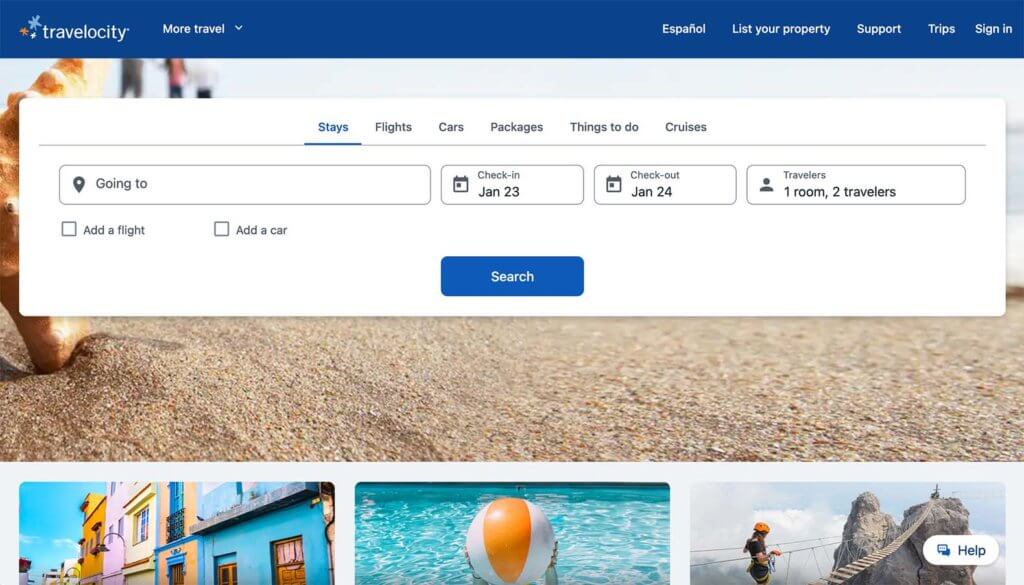
There’s no question about what the user should do when they land on the Travelocity website. The form is front and center with a row of quick fields designed to return quick results. What’s especially nice about this form is that it is pretty complex – note all the options across the top – but streamlined so that it is exceptionally easy for the user.
4. Red Bull Contact/Chat

This form from Red Bull is as simple as it gets with a chat feature for support or help. The split screen design features a nice photo and header that tells you what the page is about with the form to the right. There are clear instructions and a big red button to complete your action.
5. Misfits Market

Using a pop and an on-site form, Misfits Market allows new shoppers to sign up with just an email address. This is an effective form page because it is a low barrier to entry for users. They can enter an email address to see if they like the products offered and add more information to their account later if they choose to make a purchase.
Build Your Own Website Form Today!
Now it is time to take your website forms to the next level with form pages and forms that help create lead generation, grow email lists, or even facilitate e-commerce on your website.
The Kadence Blocks Form Block is a great place to start. You can easily create a marketing or contact form within the WordPress editor and support for many common field types.
Learn more and get started today.
Carrie Cousins has more than 15 years of experience in media, design, and content marketing. She works in digital marketing and is also a freelance writer and designer, specializing in creating amazing experiences online for small businesses. Her work has been featured in publications such as Design Shack, Webdesigner Depot, The Next Web, and Fast Company. She’s an avid runner, which comes in handy with Australian shepherds at home.