Everything you do on your store leads your shoppers to one final, critical experience: checkout. And there’s a lot that goes into someone’s decision to purchase your products.
That’s why it’s so important to get your checkout “flow” — the transition between one field or page to another — as smooth as possible. The default WooCommerce checkout is an excellent starting point, but depending on your store, industry, or products, there may be more that you can do to make the process simple and pain-free.
Let’s take a look at how you can optimize the checkout experience for your shoppers and improve your conversion rate.
How the default WooCommerce checkout flow helps you succeed
By default, the WooCommerce checkout page is designed to be as smooth as possible for your customers. And with a theme like Storefront, you’ll present a simple, clean experience that serves as a strong final touchpoint for everything else you aim to do with your store.
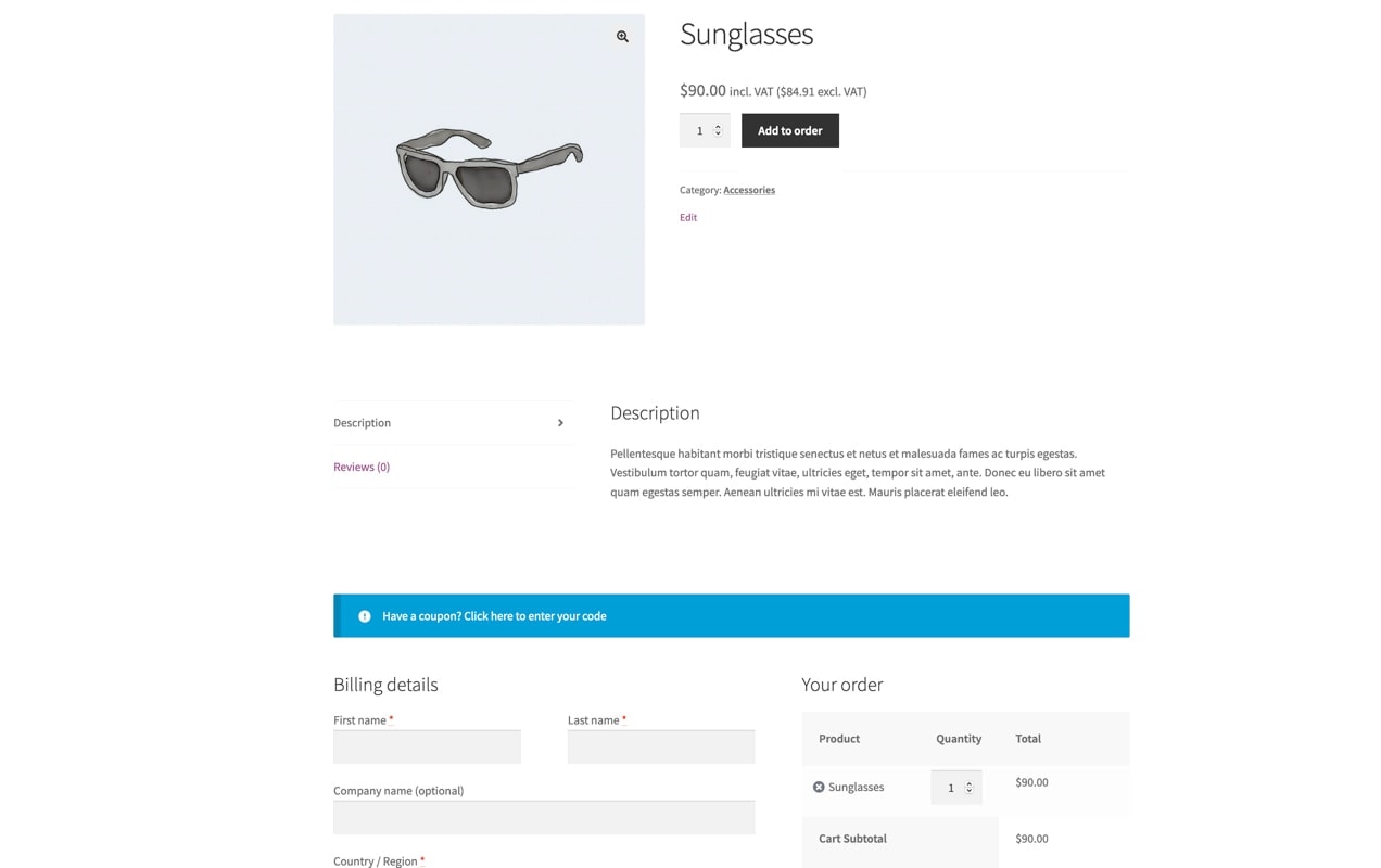
From the shopping cart, a customer proceeds immediately to a single page to enter billing and shipping information and view a summary of their order. This simplicity saves time and reduces distractions.
If you offer multiple payment or shipping options, customers can easily toggle between them without any lag or wasted space. This sets expectations right away so a shopper who chooses to pay with PayPal, for example, knows they’ll move off your store to pay.
The checkout page can also be as long or short — or as complicated or simple — as you want it to be, depending on the settings you choose. If you only ship to the United States, for example, you can easily select that country as the only option, saving customers time and hassle.
Editing the checkout page
Although the default WooCommerce checkout creates a solid, flexible, and streamlined experience right out of the box, it might not be perfect for your store.
Different industries, stores, and products merit different checkout experiences. If you sell products that are personalized, your shoppers will be more careful about the items they’ve chosen, and much more likely to double-check their specifications at the last moment. A quick checkout that rushes them through the final steps and omits those details might be seen as a negative experience.
Want to create additional personalization options for your products? Get Product Add-Ons to offer gift messages, donations, laser engraving, and more!
Also consider products that are likely to be business purchases, like laptops or desktop computers. A streamlined checkout that glosses over the details or obscures pricing could be problematic, especially if the purchase needs to be submitted as a company expense.
Before making any changes to your checkout, think carefully about whether your customers are likely to want to speed through checkout or if, like in the situations above, they crave those little details.
Consider a one page checkout
One page checkouts are popular — and often increase conversions over multi-page versions due to their simplicity — but the right choice depends on your shop and audience. Just like guest checkout (which we’ll touch on in a bit), one store might see orders go through the roof, while another might see a decrease in sales.
Why? Well, the truth is that it’s not really about the number of pages. It’s about the signals you’re sending to shoppers. A one page checkout can be just as tedious as a multi-page checkout if it contains unnecessary fields, annoying questions, and distractions.
Finally, if your checkout is broken into multiple pages, you might consider adding a visual indicator of the shopper’s progress, which could make them worry less about how much they still have to do to place their order. Even though their checkout is technically only one page, this is something you can see in action once you leave the Xero Shoes shopping cart:
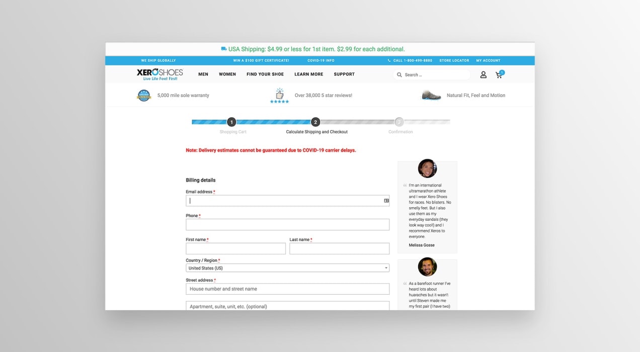
This changes a shopper’s perception from “ugh, how long until I can order my shoes?” to “oh, just one more step until I can order my shoes!”
Eliminate unnecessary fields to speed up the process
Depending on what you sell in your store, you might not need some of the default WooCommerce checkout fields. Perhaps you don’t ship any physical goods, because they’re picked up from your location or are digital downloads. Or maybe you don’t need to ask for a business name, because you sell solely to consumers.
You should consider eliminating any unnecessary fields to speed up the checkout process for your shoppers. No one wants to fill in their shipping address if their product isn’t shipping, after all. So why not just turn those off completely?
You can easily change checkout fields thanks to the WooCommerce Checkout Field Editor extension. Rename, edit, or remove any and all fields from the default checkout page without digging into any code.
Of course, it goes both ways, too. If you need to add a field — or simply make an optional field required — you can do so in a matter of seconds. Let’s say your store offers local pickup, and you want customers to specify the date they’re dropping by. Add a date picker field, make it required, and voila!
One note of caution: removing default checkout fields has the potential to interfere with the styling and behavior of some WooCommerce themes, so keep this in mind. Also, if you don’t ship products, you can turn that option off entirely via a global setting rather than removing the fields — it’s a little easier.
Keep customers on-site to pay
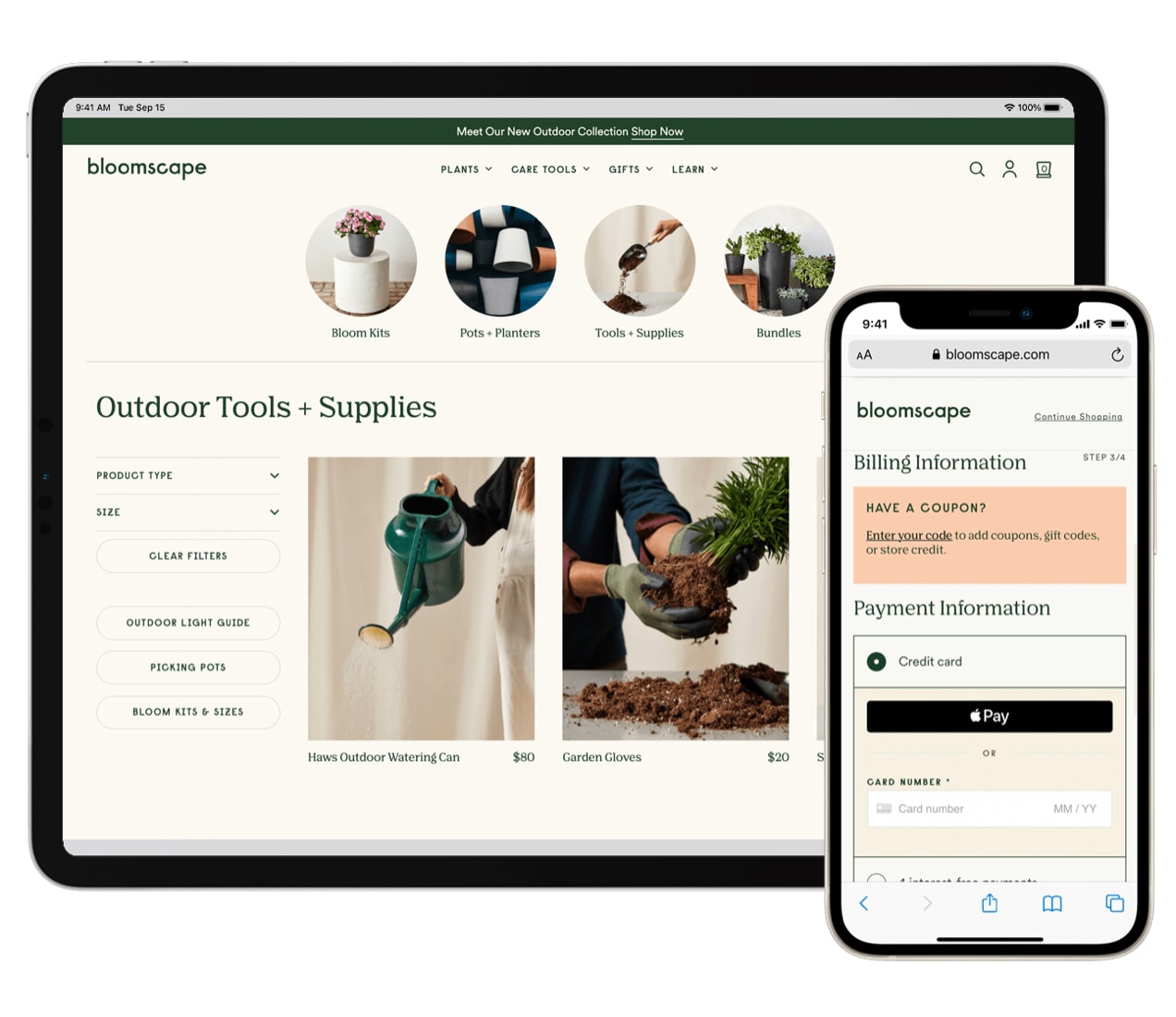
If customers have to leave your site to pay for their items, the entire checkout flow is disrupted. They could easily get distracted and go somewhere else, or they may not trust the third-party site they’re directed to.
That’s why choosing a payment gateway that keeps customers on your checkout page throughout the entire process is so beneficial. WooCommerce Payments is one that’s super simple to integrate with your store.
It helps you reduce abandoned carts while allowing you to manage everything from recurring payments to disputes and refunds directly from the WordPress dashboard. Plus, you can also take advantage of instant payments and accept Apple Pay.
Provide access to details on the checkout page
Some products are complex, require a lot of information, or have pages packed with photos. But even with all the extra data, there are times that you have to add more at checkout. Maybe you sell dangerously hot sauces that require a warning or want to remind customers of your return policy.
It’s certainly important to get these last-minute reminders in, but adding distractions to the checkout flow is a bad idea. Links that take a shopper off the final page can potentially ruin a sale if they’re distracting enough.
The best way to offer important, last-minute information while preserving the checkout flow is by adding links to content that open in a new browser tab. This way, if a shopper needs to view your return policy, FAQs, or safety warnings before purchasing (hey, ghost peppers really are hot!), they can do so without potentially abandoning their cart.
Don’t let customer accounts trip you up
Required user accounts are right for some stores, but not others. If you sell digital downloads tied to an email address, sell memberships, or serve customers likely to order frequently, it certainly makes sense to ask them to sign up before purchasing.
Otherwise, guest orders — and guest checkout — will do just fine. Asking a customer to stop what they’re doing to sign up is not only a huge interruption, it can be annoying. And for some shoppers, that’s enough to send them to another store.
If you don’t want to force shoppers to create an account, but still want them to have the option, you might consider adding a “create an account” prompt either before or after checkout. This keeps the process moving along, but also offers the chance for interested shoppers to save their information for next time.
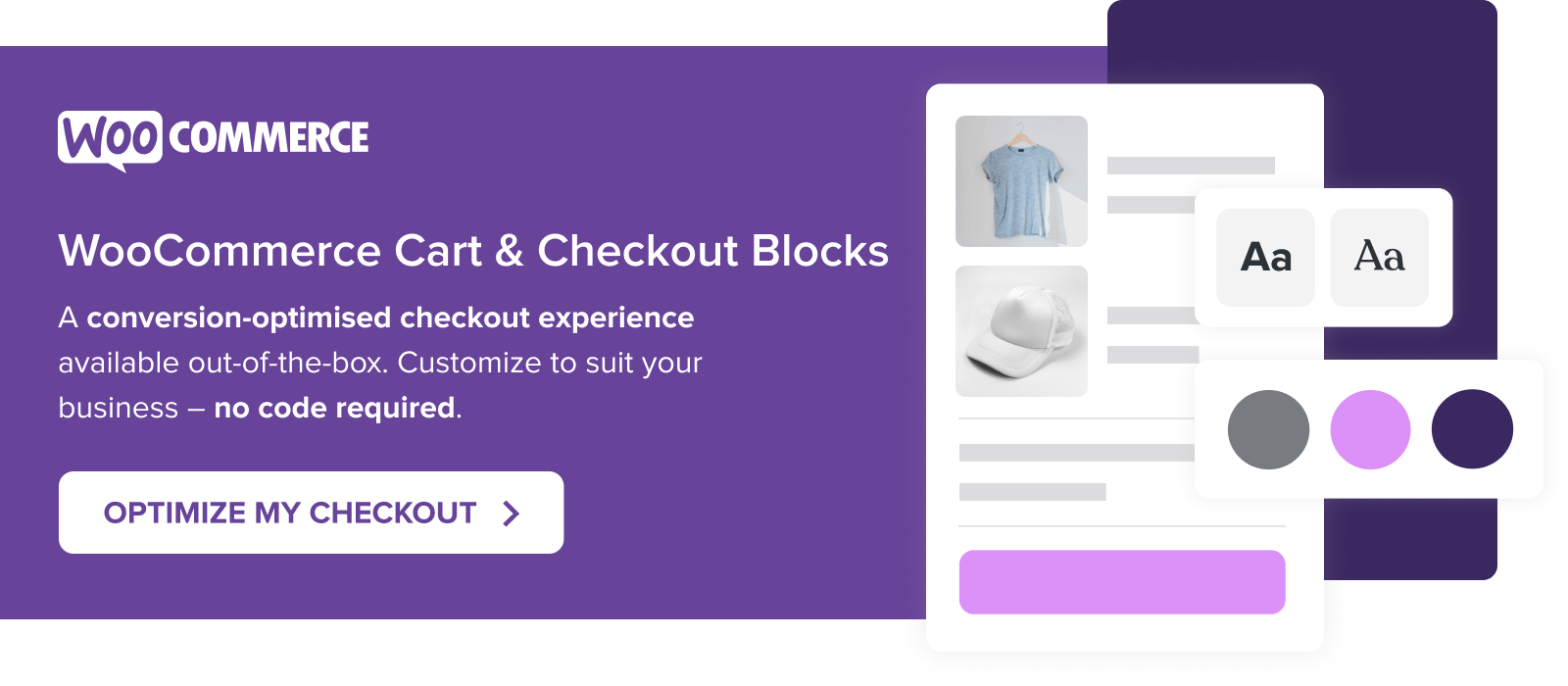
An easier way to build an effective checkout
Taking into account the principles above — like building an easy process for customers and removing unnecessary steps — WooCommerce recently released a new Checkout block. You can use this as an alternative to the default checkout process with the free WooCommerce Blocks extension.
What exactly does this look like? You can use the Checkout block like any other WordPress block, and even add additional blocks to the Checkout page. Want to add the FAQs, instruction manuals, or safety warnings we discussed earlier? It’s as simple as dragging and dropping a block from the WordPress editor.
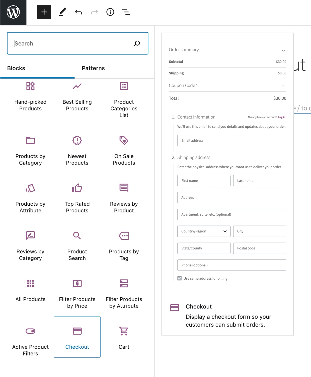
Want to remove checkout fields? Just toggle a button — no additional extension or custom code required.
Plus, you can choose to offer any payment method you’d like, from credit cards and checks to express options like Apple Pay that make things faster and easier for your customers.
And the best part is that everything’s on one page — contact details, billing and shipping information, and a clear, no-frills-added order summary. It’s a checkout built specifically to streamline the process for both store owners and customers.
Learn more about the WooCommerce Checkout block.
An optimized checkout leads to more completed orders
Much like everything else in eCommerce, not every default setting will be right for every store. It’s important that you optimize your checkout page based on your products, business, and audience for the best possible results.
Have any questions about optimizing your checkout experience for fewer interruptions, happier shoppers, and more completed orders? Leave them in the comments below and we’ll be happy to help you out.