
07
Dec
2022

Today we are proud to announce the long anticipated v7 release! Since our last major update (v5), we’ve been planning to further improve the pagespeed and performance of our themes and the Builder. The v5 update focused on the frontend pagespeed, whereas v7 is for the backend performance. The main goal is to make our themes faster and with better stability. We’ve re-coded many components in the backend to optimize the overall code — less database queries and lighter code (PHP/Javascript/CSS). We are happy to see many of our user sites getting A+ score on Google Pagespeed Insights (see some of our featured user sites and showcase). This update will make our themes much faster and better!
A significant frontend change in v7 is the Builder row grid system. We’ve replaced the old CSS flexbox to CSS grid to handle the Builder grid system. Using the CSS grid gives more layout possibilities such as adding unlimited columns, column re-ordering, and creating tiled-like grids.
This is a big update, so we jumped from version 5 to 7. Due to the data structure and grid system changes, we highly recommend not to downgrade your theme once it is upgraded to v7 (read the important notes at the end of this post for more details). Note that all Builder addons and Builder Pro must be updated as well in order to use with v7. Testing the theme update on a development/staging site is recommended.
Unlimited Columns
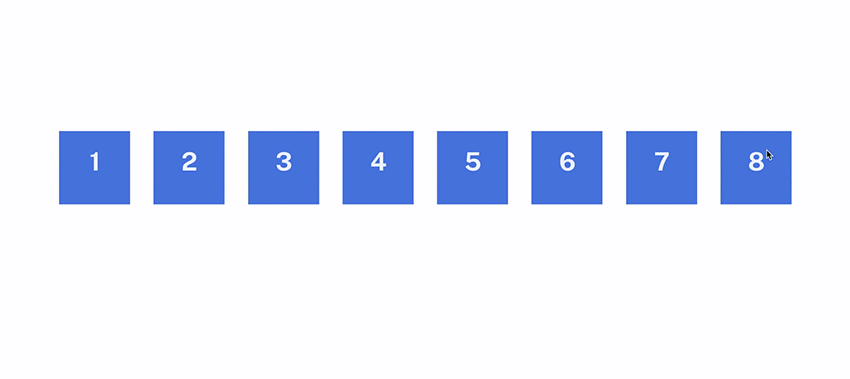
Themify Builder is no longer limited to 6 columns. Now you can add as many columns as you want.
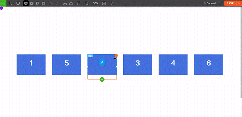
Responsive Column Order
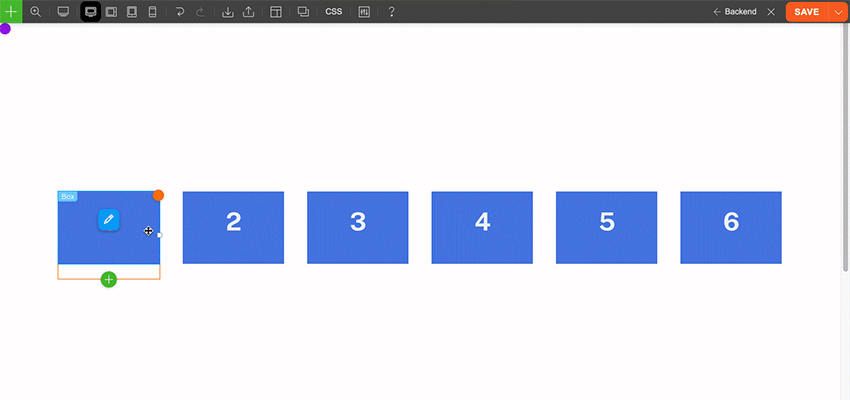
You can move columns to any order or to another row as you like. The old version could only display the columns in left-to-right order or right-to-left on responsive mode. The new version allows you to position columns in any order for desktop, tablet and mobile. That means you can move the last column to the second on the tablet and move first column to the third on mobile.
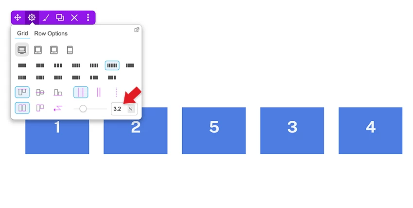
Responsive Gutter Size Control
Now you can set global column gutter width at Themify > Settings > Themify Builder Options. On each Builder row, you can also enter custom gutter width to override the global setting. The gutter sizing is also responsive. You can select/enter different gutter spacing for desktop, tablet and mobile.
Responsive Column Resize
One of the handy grid features is being able to resize the column width by resizing the column divider. We’ve improved the feature to allow you to resize the column width differently for desktop, tablet and mobile.
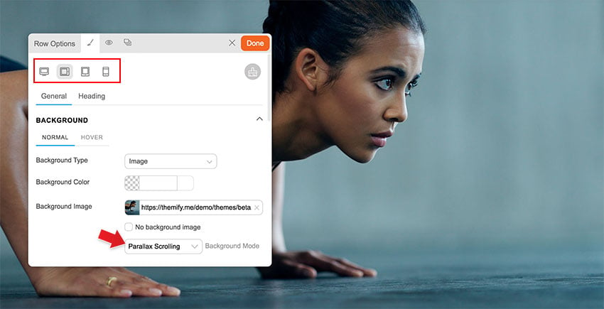
Responsive Background Mode
The background mode now can be responsive. Basically it allows you to select a different background mode for desktop, tablet and mobile. For example: you can have a parallax background image on desktop, zoom on tablet, and then fullcover for mobile.
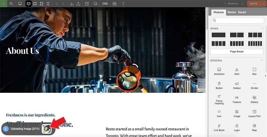
Layout Demo Image Import
When you import a predesigned layout or skin demo, our framework can download the demo layout images to your site. This will prevent broken or not found image errors when our server is down or the image files are removed on our server.
Row Frame Animation
We’ve added a little nice touch to the row frame. You can enable animation on the row frame to make it scroll in forward or reverse direction.

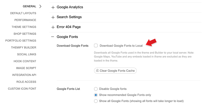
Download Google Fonts for GDPR Purpose
Due to the GDPR laws, a lot of European users are concerned with using Google Fonts because Google uses cookies to track the font usages. So we’ve added a feature to download the in-use Google Fonts to your local server. To enable this feature: go to Themify > Settings > General > Google Fonts, check “Download Google Fonts to Local”. Once you enable it, our framework will download the Google Fonts that are called in the theme, the Builder and the Customizer.
New Modules
There are several new modules added in the core Builder and Builder Pro.
Table of Content
The new Table of Content module is very useful for creating documentation and tutorial posts. The module is very easy to use. You just need to select the headings (eg. h3, h4) and it will generate a table of content automatically. It has the built-in scrollTo feature which allows users to copy the anchor URL and share it.
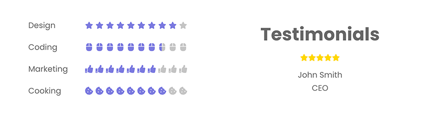
Rating Star
Rating Star is a simple module for display rating stars with full customizations. You can select custom star icon, add text before, text after, set the number of stars, spacing, font, color, etc. The similar rating star feature is added in the Testimonials module as well.
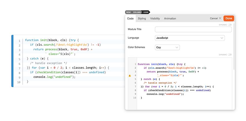
Code
For the coders out there, you would love the new Code module. If you post a lot of code snippets/tutorials on your site, this Code module is extremely useful. Simply paste your code and it will convert the HTML entities such as ‘<‘ and ‘>’. It even has code syntax highlights for various programming languages. You can select a large range of color schemes from light to dark.
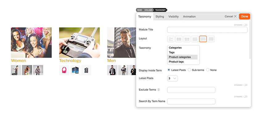
Taxonomy
The Taxonomy module has been requested a few times in the past and we are happy to include it in Builder Pro. It lets you display any custom taxonomy along with the cover image and the recent posts of the terms.
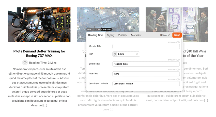
Reading Time
Reading Time is another new module added in Builder Pro. It is for editorial sites to display the reading time of the posts. It scans the length of your post content and estimate the reading time. You can use Reading Time in both archive and single post templates.
Important Changes & Notes
- CSS Grid and Column “%” Padding Change
The previous versions used CSS flexbox to handle the row grid. Now it has been changed to CSS grid. This affects how the browser calculates the column padding with “%” unit measurement (“px” and “em” column padding is fine). When you upgrade the theme and turn on the Builder, it will convert the old column “%” padding to a new value that matches your layout. This is the expected behavior (don’t worry). Due to the changes, we highly advise not to downgrade the theme after the upgrade. Test the new version on a staging/development site before you upgrade it. - Body and Column Classes Removal
Some of the body classes (eg. tb_responsive_mode) and column classes (eg. second, third, etc.) are removed. If you have existing custom CSS that targets those CSS classes, they will no longer work. Please contact us or post on our support forum if you need any assistance to update your CSS for the new version. - Removed Click Mode
Since most users prefer to use hover mode, we’ve decided to remove the click mode to simplify the Builder UI. - Avoid Downgrades
Once you upgrade to v7, please avoid downgrading to the previous versions as it might affect your layouts. If you update the theme, edit the Builder layout, then downgrade the theme to the previous versions, the following might/will be affected: - Column “%” padding: Since the new version converts the column “%” padding to new values, the padding will look different if you downgrade to the old versions.
- Column direction, auto column height, and column alignment: The old version doesn’t have responsive column direction, auto column height, and column alignment. If you downgrade the theme, they will be reset back to default.
- Column gutter: The old version doesn’t have responsive and custom gutter width. If you enter/select the custom gutter width, downgrading the theme will reset them back to default.
- Custom column size: The new version allows you to resize column width for responsiveness. Downgrading the theme will reset them as well.
- More than 6-columns: If you add more than 6 columns with v7, downgrading to the old versions will reset the grid.